


Behind the Logos: What Your Kid’s Favourite Band T-Shirt Really Means

For decades, band logos have been more than just artwork — they’ve been the visual heartbeat of music culture. When a child wears a band t-shirt, they’re not simply putting on something cool; they’re wearing a symbol loaded with history, creativity and attitude. These logos are recognisable across generations, instantly communicating rebellion, energy, or the unique personality of the band behind them.
Kids love them for their bold shapes, striking designs and sense of identity. Parents love them because they’re nostalgic and meaningful. But behind each logo lies a story, and those stories make these tees even better.
Let’s explore the real meanings behind some of the most iconic band logos we feature at KidVicious — and why they’ve become essentials in every little rocker’s wardrobe.
The Misfits – The Crimson Ghost
![]()
The Misfits’ skull — often called the Crimson Ghost — is one of the most famous images in punk history. Surprisingly, it didn’t begin as a band logo at all. It originally appeared in a 1946 horror film serial, where its dramatic, ghostly design made it unforgettable. The Misfits adopted the image in the late 1970s, embracing the spooky, comic-book aesthetic that would come to define their version of horror punk.
Over time, the skull became a symbol of rebellion, dark humour and DIY creativity. It’s bold and instantly recognisable, yet playful enough that kids gravitate towards it without finding it scary. For many little rockers, it’s their first introduction to punk imagery — and for parents, it’s a nostalgic nod to one of the most influential alternative bands of all time.
Wu-Tang Clan – The ‘W’

Few logos in hip-hop are as instantly identifiable as the Wu-Tang Clan’s giant ‘W’. Created by DJ Mathematics, the logo was first used on the cover of Enter the Wu-Tang (36 Chambers) and quickly became an emblem of the group’s identity. The sharp, wing-like shape captures the power and unity of the collective while hinting at the martial arts inspiration woven throughout their music.
Its graphic simplicity is precisely what makes it such a successful design — clean, bold and easy for even very young fans to recognise. Kids often know the shape before they know the sound, and parents appreciate the legacy it represents: authenticity, creativity, and one of the most important hip-hop groups ever formed.
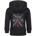
The Clash – The Star Logo

The Clash experimented with a variety of visual styles during their career, but the star logo remains one of their most iconic images. Drawing from military symbolism, it reflects the band’s powerful stance on politics, protest and anti-authoritarianism. The stark, simple shape communicates strength and defiance — key themes in punk’s message and The Clash’s music.
For kids, the visual appeal is immediate: it’s bold, geometric and easy to recognise. For parents, it’s a reminder of a band whose music helped shape an entire generation’s social awareness.
The Rolling Stones – The Tongue & Lips

The Rolling Stones’ tongue-and-lips logo is perhaps the most famous rock symbol of all time. Designed by art student John Pasche in 1970, it was inspired partly by Mick Jagger’s mouth and partly by the tongue-protruding iconography of the Hindu goddess Kali. The result is a symbol overflowing with attitude, defiance and playful rebellion — everything the Stones embodied during their peak.
Children tend to love the bright red colour and the cartoonish expression, while adults appreciate its place in music history. It’s cheeky, iconic and unmistakably rock ’n’ roll.
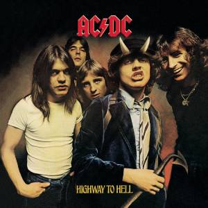
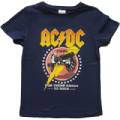
AC/DC – The Lightning Bolt
The AC/DC logo, introduced in the late 1970s, embodies the energy and electricity of the band’s music. The lightning bolt references electrical current — the basis of the band’s name — while also reflecting the raw power of their guitar-driven sound. Paired with a gothic typeface, the logo blends sharpness and classic rock swagger in a way that continues to feel fresh decades later.
Kids are drawn to the dramatic lightning bolt, while parents instantly recognise a symbol that defined an entire era of high-voltage rock.
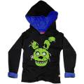
Ghost – The Gothic Lettering & Papa Emeritus Style

Ghost’s logo stands out thanks to its ornate, gothic lettering and theatrical style. The band’s entire visual identity is inspired by horror, religion, and the mysterious character of Papa Emeritus, their skull-faced frontman. The logo reflects the band’s cinematic approach to metal — dramatic, spooky and packed with storytelling.
For young fans, it sits perfectly in the category of “fun-scary”. It’s full of character without being too intense, which makes it a popular choice for children who love Halloween, monsters or anything with a supernatural twist.
Nirvana – The Smiley Face

Nirvana’s smiley logo is one of the most recognisable images from the 1990s. With its lopsided grin and crossed-out eyes, the design captures the sarcastic, irreverent attitude of both the band and the grunge movement as a whole. While its origins remain debated, many believe Kurt Cobain drew it as a parody of corporate logos and mainstream culture.
Kids respond to it because it’s playful and expressive — it looks like a doodle they might create themselves. Parents recognise a symbol that defined a generation of alternative music and continues to inspire new fans today.
The Ramones – The Presidential Seal Parody

The Ramones logo, designed by Arturo Vega, is a brilliant remix of the U.S. Presidential seal. By replacing elements of the traditional emblem with references to the band, Vega created a logo that was both official-looking and subversive. It perfectly reflects the Ramones’ approach to punk: straightforward, punchy and proudly tongue-in-cheek.
Children like it because it feels like a badge of honour — a symbol of belonging to something cool and exclusive. For adults, it’s a reminder of the band that helped kickstart punk rock.
Why These Logos Appeal to Kids (Even Before They Love the Music)
What makes these logos so child-friendly isn’t just their connection to great bands — it’s their visual power. Kids naturally gravitate toward strong shapes, high-contrast designs and images that feel a bit rebellious or mischievous. Band logos offer a way for them to express personality, even if they’re only just beginning to discover the music behind the symbols.
Parents, meanwhile, enjoy the chance to pass down their favourite bands in a fun and age-appropriate way. A t-shirt is often the first step in introducing kids to the albums and artists that shaped their own youth.
Every Logo Tells a Story — And Your Kid Gets to Wear It
Band tees aren’t just clothes; they’re tiny pieces of cultural history, wrapped up in bold, brilliant artwork. When your child wears a band t-shirt, they’re carrying a legacy — one that’s cool, creative and full of meaning.